PERSONAL

So I have set up my own personal blog to moan, post beaut photos, life and everything going on really. Quite excited, since uni has 2 weeks left till I'm done, starting up this blog will hopefully be a really good move and a good way to document my life right now. Along with my buisness which will be up and running really soon a lot is changing so documenting is my new pass time 
Have a look and a follow, please.


INSPIRED

A massive art of my life is reading magazines, art, music and fashion.. I always feel well inspired by the articles, photos and layouts that they each produce a month. Most projects that we get assigned I try to develop my own style from the different influences I have had from the magazines. At the moment we are starting/developing a typeography project which I am really enjoying collecting different bits of information and layouts as this is going to be my first computer based project/sketchbook.. As I feel giving my work different feelings is a good thing that keeps everything a lot more interesting yet keep a similar flow through my work created on a computer and my hand done work.

CHRISTMAS SLACKING

Whilst being off for christmas its been pretty non-stop. I finished uni on the 15th December and the 16th (friday) I was off to the alps for a little bit of skiing with the snow-sports team.. oh the hard life. 
It was such a good time, I love the environment that is a so tranquil and picturesque totally different from being stuck at home in Manchester! Being there I decided to make a video of the time so I could add it too my reflective journal work for uni.. I didn't realise how much fun I would have filming it or bringing the people that are in it together.


(better quality - http://vimeo.com/34225306)
Although short and sweet and the majority of the footage is of myself and my friend ellie falling in the snow, it was an experience and holiday I shall never forget and have to hope the chill factore lives up to Risoul, Of course it was the most teetotal holiday of my life also.


Best skiing holiday yet, although I was so tired and just got a lovely chest infection.. too much fresh air.

I've also started re-putting my portfolio together again, for the uni interviews I have in 2012.
I'm finding it ever so hard to choose and how I should now present my work. I have a love hate relationship with mount board I think in a portfolio its going to highlight the work that I personally think is the best and thats not always the case of course I love all the work that is going into my portfolio.. but some of the piece are from my end of year show at college and had to present on mount board to give our work more of a 'professional feel'..
However I am persevering, and making everything look beautiful or even more beautiful than the beauty it had before.


Through the christmas break I have a reflective journal that has to be handed in when we get back to uni.. I am really enjoying putting and adding to mine. I feel its like my own personal sketchbook full of everything that I love and care about along with different artists, blogs, books, music its somewhere that I can also use to document my uni & home art work. 


Anyway.. its lovely doing art work and getting everything ready for a completely different 2012. I need to tidy my room so bad, its a horrible case of "No, I'll do it later" and "TOMORROW".. However tomorrow will indeed be 2012, and ending/starting a year in a clean room will mean more space to mess it up prepping my art work. Wish me luck! 

HAPPY NYE! 

THEME IT EXPAND IT

So in the mad rush to finish off the other 6 projects. We got our final project called theme it expand it. basically. Merge the previous projects together to make some hybrid of a piece. My projects are all pretty different. Lie of the land was a weaved piece from a reeds. My word project was based off the I Heart NY - Milton Glaser style piece. Then I did my trash tablecloth. 
DILEMMA. 

I decided that I would focus on just parts of each of the 3 pieces. I started creating initial ideas to be able to see where I could go with the design as I focused on creating a poster as this would be the most effective way to combine all 3 ideas together. 
My first Idea was a I 'coffeecupstain' coffee.. As I thought it was playing on the different elements although mainly word and trash projects. 
I then designed another poster idea with the thumb from the word project in a weaved pattern e.g. a little of the lie of the land and a little word. 
These ideas worked.. I liked the thumb idea so I decided the work I am going to produce for my final piece would be based around thumb.. 
So I have started to use the thumb to create different types of weaves and patterns with the thumb design.


I felt with this pattern with the size of the thumbs being so big the pattern becomes less about the thumb as its quite an abstract pattern. I felt that using the overlapping style from the trash project.. a type of weaving from the lie of the land and the thumbs from word project I feel that the final result is pretty successful. I however am going to add a little hint of red to link more to the word project again. 


I am overall happy with the final design I have come up with for my Theme It Expand It project!

KLAUSALICIOUS

Whilst on the course one of our lectures each week on digital media, basically learning photoshop basics. 
Its not my favorite but thats only because doing my photography A-Level I learnt it all, so I dunno probably being really snobby and just not caring because I am thinking I am big & clever? 
Anyway the brief is to create a blog, poster or leaflet on a notorious celebrity.. People came through my mind like Charlie Sheen, Amy Winehouse.. I want to do someone that had and is in the public eye right now. 
I ended up choosing Liam Gallagher. Blah. Typical Manchester kid. Choosing some stereotypical mancunian with an attitude as bad as his hair. BLAH. 
But hey ho. I like Pretty Green, Oasis, Beady Eye. ANYWAY. I am enjoying developing my mini sketchbook on Liam. 
I chose to do my poster on Beady Eye and create a gig poster. I felt like using my media work from A-Level I could use the tips that I learnt from that, I feel that maybe a little cheating. TOTES DIFFERENT THOUGH. 


I decided to look at gig photos that professionals had taken to get a more intimate portrait of Beady Eye and encorporate their logo. I also feel that I could use the photos to create a 'live sessions album' poster or a gig poster like I was originally planning. 
I still have a lot of work to do on them to finish and create a quality final piece. 

WE DON'T SERVE FOOD HERE FINAL PART.

Safe to say I let the table cloth dry over night, didn't look at it throughout the day to give my mind a rest plus I was in the studio all day. 
However, when I came back and whipped it out from the scrummpled mess on my floor (it was neat, although the morning came and I lost a vital t-shirt for the days outfit. Yet again, Pre Planning) I wasn't happy with the overall look it was empty, dull and was just lacking everything that the work I had been producing had. I decided that I would tackle the issue head on and got on with the task of finding a new colour.. IMPOSSIBLE. 
So using my sheer knowledge I decided the ol'gravy browning would maybe work.. Thinking back maybe pre-testing it would have been a clever idea. whatever. 
I mixed the ink and water and added quite a bit of the gravy browning and it made this rich and everything I could ask and dream for colour.. WAHOO. Off I printed. 


CLEARLY 1,000,000 TIMES BETTER. 


Before & After - The pattern is so much stronger now within the table cloth and stands out for itself rather than getting lost within the depths of the white space. 


I am really happy with this result overall and think it has the perfect balance of soft undertones of 'previous' and 'old' looking marks and the fresh and bold new ones that tie together my whole project. WAHOOOOOO. I think that this as my final piece works so well and I am going to look it again and see if a couple more marks could be added but overall HERE IS MY FINISHED PIECE FOR THE TRASH PROJECT.

WE DON'T SERVE FOOD HERE PT 1

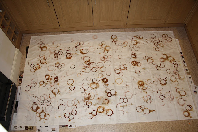
Its been 4 weeks coming I am glad to say that after printing at least 1,000 coffee cup marks on a4, a3 & a2 paper the challenge of a 140x140 table cloth was a head of me.
The daunting task included buying brown fabric dye, which is near impossible as Hobbycraft stocks one shade of brown to my horror. (PRE PLANNING NEXT TIME)


After pressing on with the first mark, the tension in the kitchen was intense. The fabric dye I had used before but on t-shirts so I was pretty confident with it working out also the colour and everything wasn't like the work I had been producing for the last 4 weeks. HoHum. 


The technique that I made up was put a blob of the fabric dye and mix it with water on a plate making a thiner consistency like the consistency of a coffee, tea or drink I have been using.. It worked perfectly although in some of the images you can see a little bit of bleeding but I managed to avoid this after learning to soak up the access after a while of letting it soak in to get the main colour.. 


Overall I was pretty happy with the design and how it turned out, as I decided to roll with the unstructured pattern as I felt it would work better as a table cloth is normally used in a formal setting an informal pattern would create the vibe that I want to pursue. How excittinggngnngnggn! 

CATCH UP-AHOLIC

I've been cray cray busy with uni work and the odd bit of skiing, blogging has just had to take the high road for a while. 
The ring project is on its last week. I am excited for it too end now. 4 weeks of circles, coffee and the stench of gravy browning.  
The last two weeks have called for experimenting with shapes, textures and visual patterns I can create that relate both to the graphic side and the natural formation. Juggling the idea of the faux coffee ring has been a little controversial at the least, especially when Rachel Whitehead lOndOn 2O11 poster was shown.. I was so cross clearly she is an avid reader of this blog and sneaks into the studio whilst I am slaving at home! 


Creating the ring pattern for one of my experiments, safe to say I got V cocky with it. ah well. It gives it a 'fluid motion that helps break up the intense pattern' 


I hang up all my sheets opposite my bed, that way I can see the improvements to be made and see the progression that has taken place. I am glad I chose to do a range of different samples. Its deffo helped me find my final idea in the colour and how I am gonna produce it. 


The traced 'faux natural' rings. I love them.